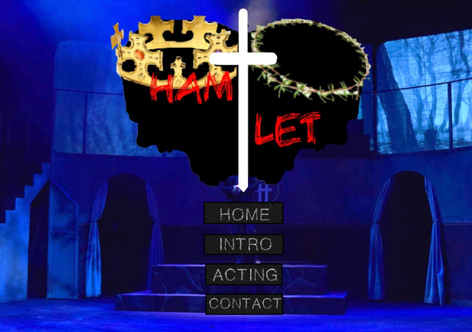
 This logo is designed with the contrast between light color and dark color. I use black to draw two shadows of two men screaming. One with a golden crown and the other with a grass crown. The shadow with the grass crown is the “crazy” Hamlet and the one in golden crown is someone who tries to fight for the throne. I want to interpret the madness for Hamlet to revenge of his father’s murder so I design the yelling faces. In the middle of two men, the white cross with sharp edge is actually a sword. I hope to match the story theme. Because white is representing peace, I want to use this color to show the love theme in Hamlet but also revealing the revenge theme. I use green, yellow and red to give a significant difference between black shadow and the light colors, this helps to illustrate and sharpen the details.
For the website layout, I used spatial mode to create a clean and simple setting. The proximity between texts and logo is a bit distanced because I don’t want to make the site too tense to read. I also added the solid bother to separate the background and text. I think this can create a tidy view for my organisation and I hope the audience can focus on the categories one by one. For the alignment, the web page is in a middle alignment. This can controls how our eyes move across a text, every piece of it is deliberately placed which makes the page feel clean and crisp where audience can look for easy-to-find information. The targeted audience is someone who is looking for Shakespeare performances - Hamlet. For the design strategies, because Hamlet is a tragedy, I used emphasis to bring out some kind of hard feeling. The screaming logo and the dark text design create a sad atmosphere to the audience and helps to reveal the theme, which at the same time stresses out the purpose of this searching website.
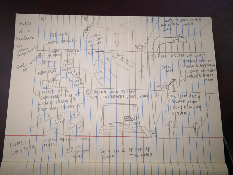
0 Comments
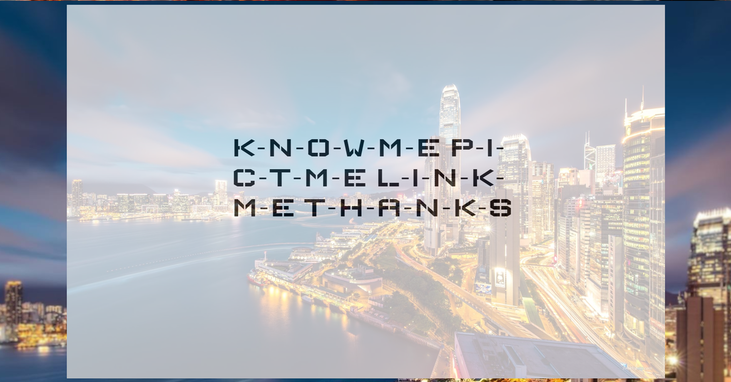 For my website, I did not have any draft and did not use any template either. I first thought of some animations, for examples the drag and drop features, animation-delay and 2D transform. But soon I found that my web page was too simple and actually I could not place an image for the drag and drop effect, so I gave up and seeked for other interesting techniques. I finally ended up with a fade in hover effect, the turned out result was really what I expected like the half transparency fade in color, the Wallpoet text font and the background of the gorgeous night view in Hong Kong. All of these context perfectly combined with each other and created a beautiful front page. I was really proud of myself! At the moment I finished the front page, I was thinking that I could be an expert in website design! Haha! Moreover, the most difficult technique I had to deal with was to add a transition effect for both the width and height property next to my photos. I tried several times to hide the enlarged photos but they just showed directly under the original photos which means there were no transition effect. So I searched for the online tutorial and finally figured out I had to change the width and arrange the class. Thanks God I finally got what I want. Although I wanted the images to place in the center to create a clean and formatted align, the enlarged images would be difficult to view if I do so. So just forget about it. Because I changed my design according to my current technical abilities, I achieved my vision at last. Of course if I knew everything about code and if I could have more time, I would probably make my site more fiddly. For example the background image could be clearer and have more contrast with the text color. Also, I would like to make my front page movable, like some raindrops sliding down from the top. Actually I think I am kind of success for this website. 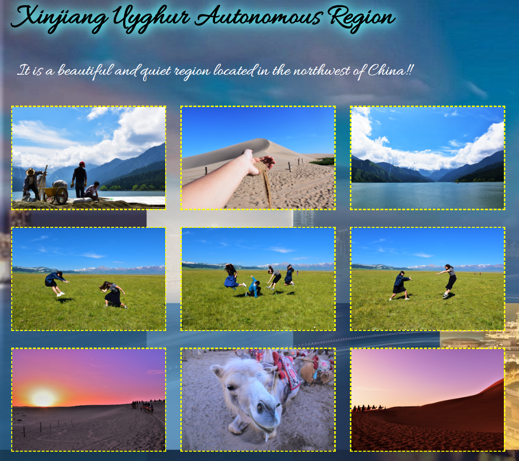 I used spatial mode in my website to create a clean and simple setting. In the “Pict Me” site, I arranged the images according to the color tones like blue, green, white and orange. It takes a little observation but when you realized it, the image setting will be satisfying and easy to focus in each columns. The proximity between texts and images is distanced because I don’t want to make the site too tense to read. I also added the dotted bother to separate the background, image and text. I think this can create a tidy view for my organisation and I hope the audience can focus on the words and the photos one by one.
For the design strategies, I used emphasis to bring out an optimistic image where I posted several photos with funny pose and in light color. This creates a happy atmosphere to the audience and helps to reveal my hobbit in photography, which at the same time stresses out the purpose of this introductory website. Besides, I take concerns into the color contrast. As my background image combines several colors, I have to pixelate part of the background and use shadow effect for the text. I also used yellow as the bother color to make the entire information more clear to read. I hope the audiences can feel cozy while viewing my website. I know that I still have improvements but I sincerely hope you guys enjoy my site and get to know more about me. Thank you! p.s. I cannot upload the zip. file because it overs 10 MB... =_= In this website, like most introduction website pages, has two main purposes which are to provide a large amount of additional information about Shakespeare around the world and to ask for participation. For examples, there is an image gallery with descriptions near the photos, and an event schedule that listed the date and time for some workshops. I think these are what we would expect from a text within the genre of a informative website home page. The two purposes also reveal that the group of audience for the home page are mainly the people interested in Shakespeare’s literature. They may be students, professors, drama actors or writers. So, when it comes to the author, it is important to make the information accurate and checked before it is released. I think the author for this website did a good job because all the events were implied with the time, venue and simple description. He also includes images and links to the information which successfully meets his purposes - bring the global events into a concentrated spot light and ask people to join. However, the design of the web page is totally a mess and is not user-friendly. 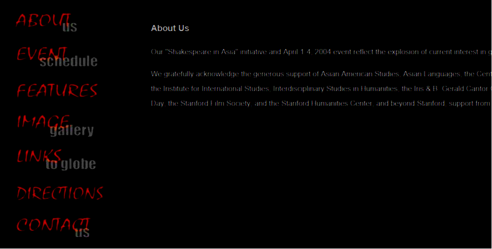 First, for the contrast in which this web is designed. The web uses black as the background color and white as font color. That’s fine. However, for the selecting columns, the font color is red. And in an extra link about the Shakespeare in Japan, the font colors are deep green and deep blue. The contrast between black and red, green and blue is not obvious. I’m guessing whether the author wants to create a dark tone for the entire website but this actually makes the web page hard to read.  Second, for the proximity, the elements are placed too close to each other which makes me feel that the author is trying to cram huge amount of information into little space. It’s too tense and oppressive. Although the author embolden some headlines and subtitles, it’s difficult to notice because the sentences are too close and the font size is incredibly small. It’s like if I scroll down the page in high speed, I am not able to find out the previous paragraph. It is easy to miss out details. The proximity for the text is really poor designed. If I was the author, I would use different color to separate the title and the content, also enlarge the font size. 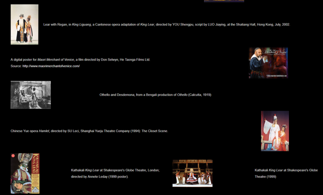 Third, for the alignment, large part of the web page is in a left alignment. This can controls how our eyes move across a text, every piece of it is deliberately placed which makes the page feel clean and crisp. This is important to an audience looking for easy-to-find information. However, in the gallery page, the alignment is irregular, some photos are placed in the left and some are on the right. All the photos are followed with a one-to-two sentence long description. It seems that the author is trying to be creative but the result is so-so. Because me as a reader, I am messed up when finding which description belongs to which photo. This kind of alignment design is really confusing.
My overall feeling towards this web page is “I will not design mine like this.” Although the information is provided in detail, the format and organisation are distracting me from getting what I want to know about. I think the author was just too lazy that all the information is put together without consideration. It is a pity. Check out this innocent but with a bit cunning smiling icon!! This is an online forum from Hong Kong called "LIHKG" where members can post and reply to anything in the group under a feigned name. However, unless you have the permission of the admin, members cannot delete what they had sent or posted. One role that the digital curation acts as is the "Storage" - keeping data and undertaking actions to ensure the long-term preservation. This function takes me in to consideration of what I can say and what I can't for the online presence. Since all the information can be backed up, in case I don't want any disturbance in my daily life, I have to double check everything for example blurring user icon in some captures, deleting personal features in photos before I post it online. I'm afraid of being shown to the whole world... Well, digital curation is an double-edged sword. It helps to store general information for future research but at the same time it saves individual information which is a threat to our personal security. Like if you become famous, the haters can search for your past experience and bad-ass histories to reduce your fame. But that's how we create and enlarge the technology spectrum - we take in and spread out, we reply and share. We want to gain and don't want to loss, so we invest different kinds of security methods to prevent it. We are improving the technology world. 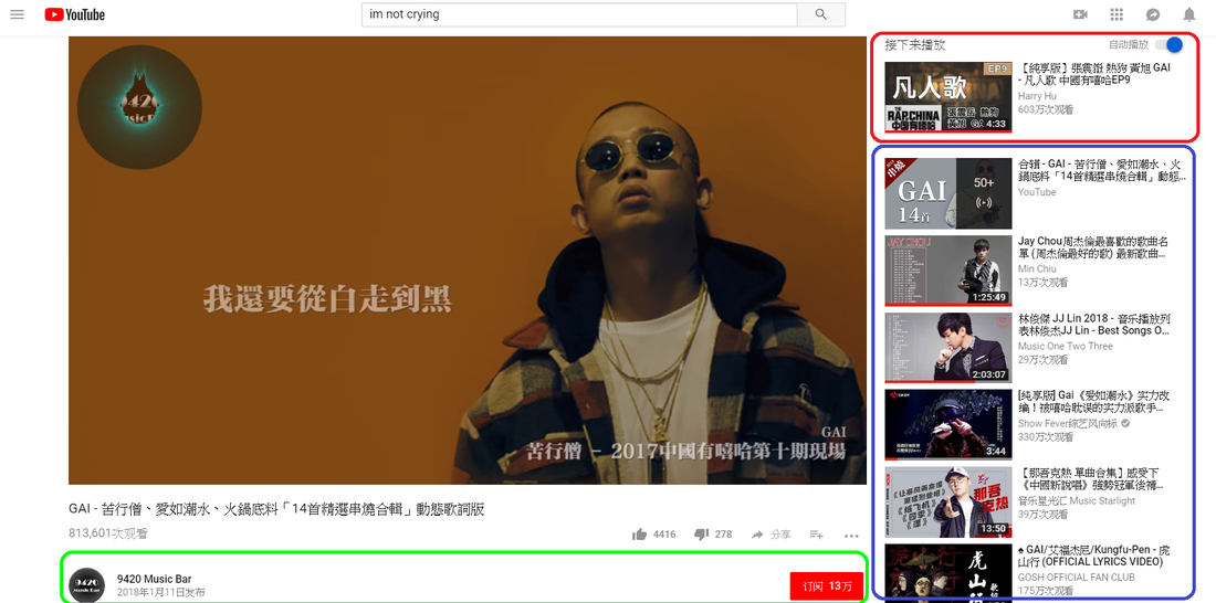 Besides, it is very often that we spend more and more time on informative media. Use "YouTube" as an example, when I finished one video, there are always other videos for me to choose. The auto-play function and the preference videos in the right hand side, the subscribe bottom, the alert function, etc. It recommends several additional videos for me to watch and I can just click on it and there will be other options in the next video! This kind of selecting system is in a hoop that never ends. That's why I keep watching YouTube when I start with the first one... It's crazy that I'm putting tonnes of time in it unconsciously!!! I beg you too!! I think these are the format of organization display in the digital curation. Through our selections in several spectrum, the online archiving technology seems to connect with us by remembering our preference and giving options for what we would like to explore. It organizes a access for users to create their own online platform which includes the information they are interested in. Our involvement can even help the online companies to make money through several advertisements. Moreover, the online archiving technologies' sorting system can be improved by filtering what the general dislike or seldom search for. This helps to boost the selection and organization process. 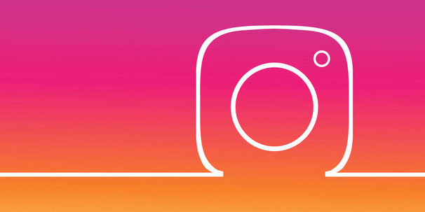 Last but not least, social media is acting an important role in our daily life. It forms a social network between the individuals. For example this well-known application - Instagram, which the user can share their movements in the "IG Story" and "IG Post". I use it everyday in every moment. I think that's how I get to know a person because people used to present themselves to others, maybe with friends or even strangers by posting photos and captions that reflect to their current feeling. I probably will reply or send a console to s/he if I noticed they are in some trouble.
I believe that the digital curation ensure that designated users can easily access digital objects on a day-to-day basis. This helps to connect different participates that share common interest and feeling, it's a bounding and a linking. The more we know about someone's daily life, the more conversation we can create in order to hold a relationship. We some how did something consciously under a purpose, but we also unconsciously gain something unexpected. That's how the digital curation shapes the online world, and ours, pause. |
Lilac's HereBEgINSIDE & INFLUENCE GoalsCategories |
 RSS Feed
